Retail Employee Mobile App
KITH, the progressive New York City retailer, began beta-testing an application for running product from stock room to sales floor in order to replace an antiquated walkie system. As a user of the tool, I sought to direct the iterations in favor of salespeople’s needs and assumed responsibility for gathering feedback and communicating recommendations. Below I detail my design process.

The Problem.
Salespeople carry a walkie system on their hip with attached earpiece weaved under their shirt, as well as a mobile device with accompanying IR scanner. Previously, crowded walkie channels disrupt sales process during high volume days, limiting efficient communication of product request to runners in the stock room.
Business Needs
Increase the % of all product request made through the app
Increase the rate of new customer relationships added
User Needs
After discussions with all stakeholders including runners and managers; speed, minimalism, and precision of product details were given top priority to the next iteration.

Interview questions I asked KITH salespeople.
“I want to communicate which shoes I need to runners quickly, so I can deliver a better client experience and earn higher commissions.”
— Footwear Salespeople
WIREFRAMES

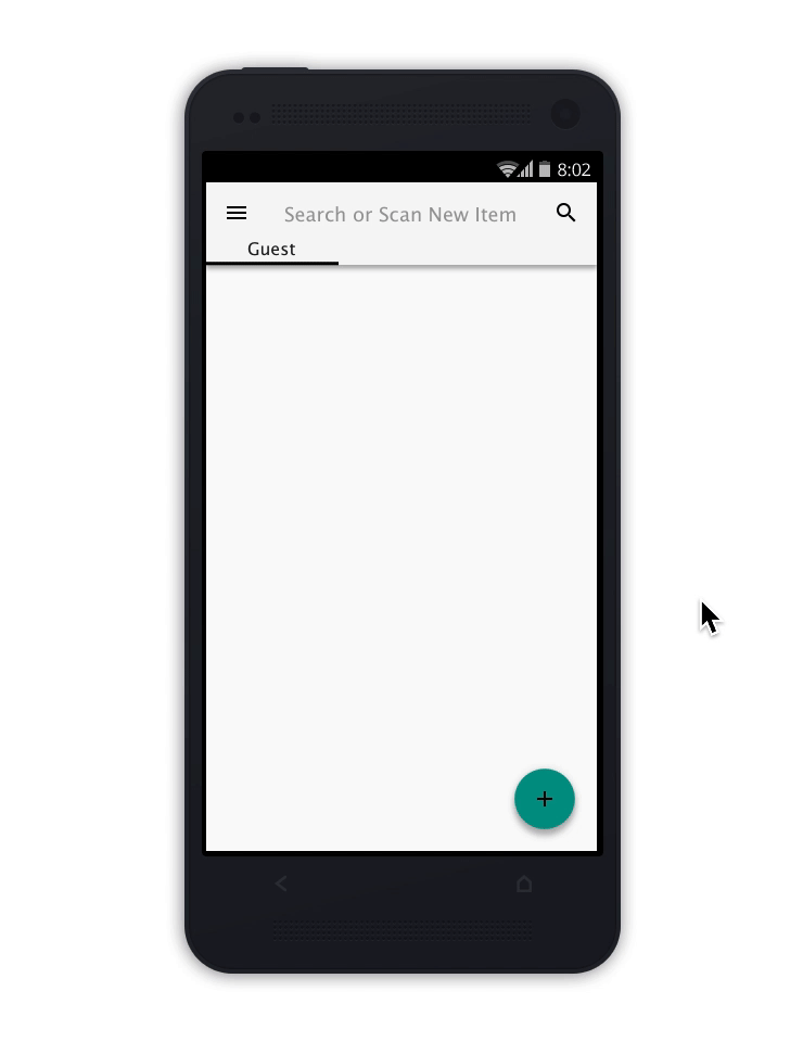
Guest Manager
Separate customer tabs create visual relief while still offering a high-level view of current service. Colored indicators throughout the UI reinforce engagement necessary to track product location while keeping interactions to a minimum.
Product Cards
Efficient service is executed when salespeople have all variation information to sell current availability or suggest adjacent products within company inventory. Details such as ‘Display’ or ‘Send to Register’ are common task that maintain smooth service throughout the day.

User Journey
Requesting Items in 3 Actions

Limiting actions needed to create product request was the primary use case the UI was designed around.
Interactive Prototype
Below we are taken through a Footwear Salesperson’s journey interacting with multiple customers, replacing a missing display item, whilst creating a customer account and delivering prompt service by sending an item straight to register.
Future Considerations
Mobile POS Development
CRM + Direct Messaging
Online Catalogue with Deliver to Home Option
In Store Pick-Up Processing
Project Details
Team: Solo Designer, External Development
Tools: Sketch, InVision
Duration: Jan ‘18 - Feb ‘18
Skills: User Research, UX Design